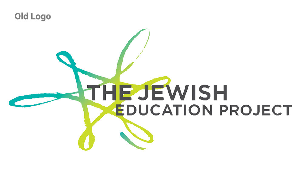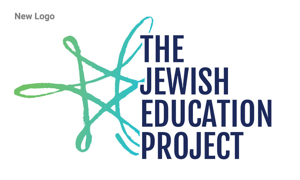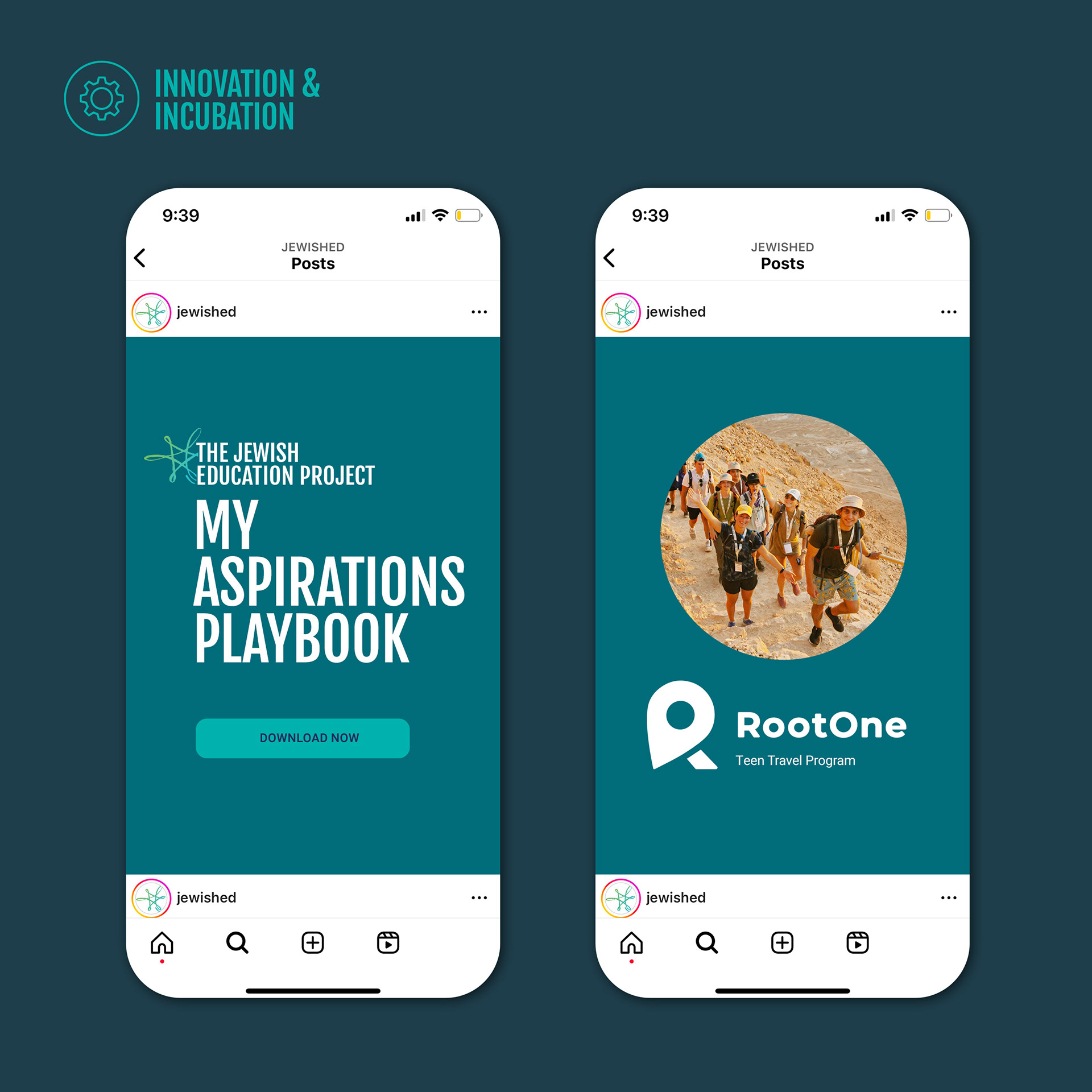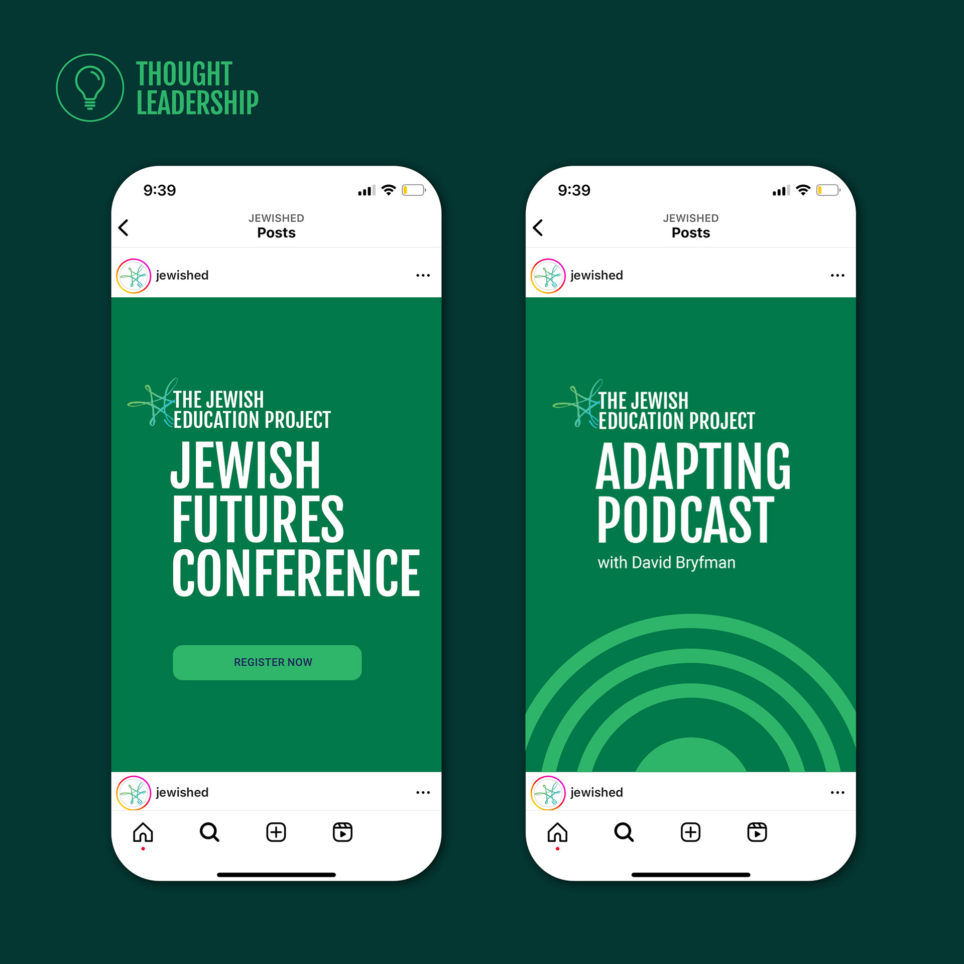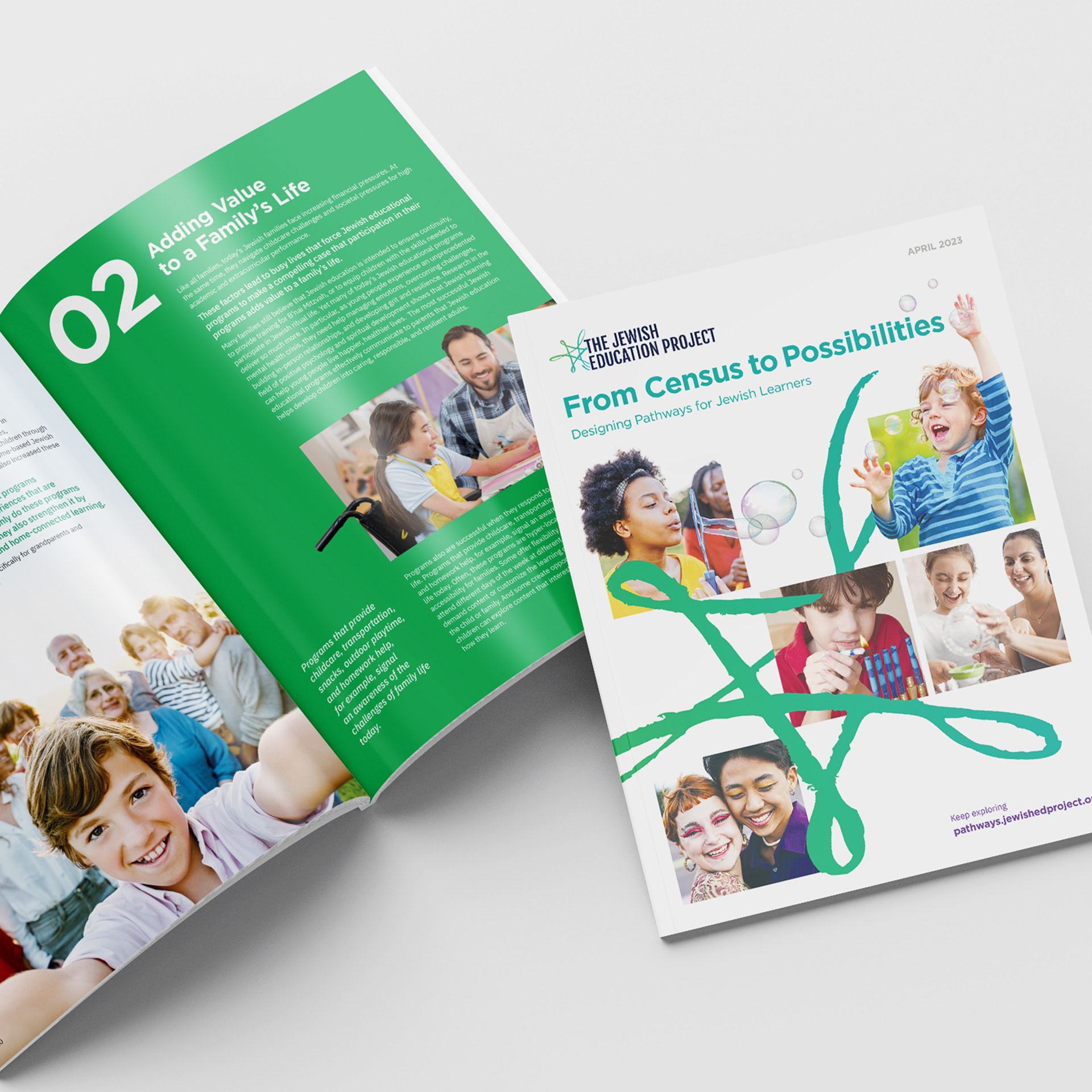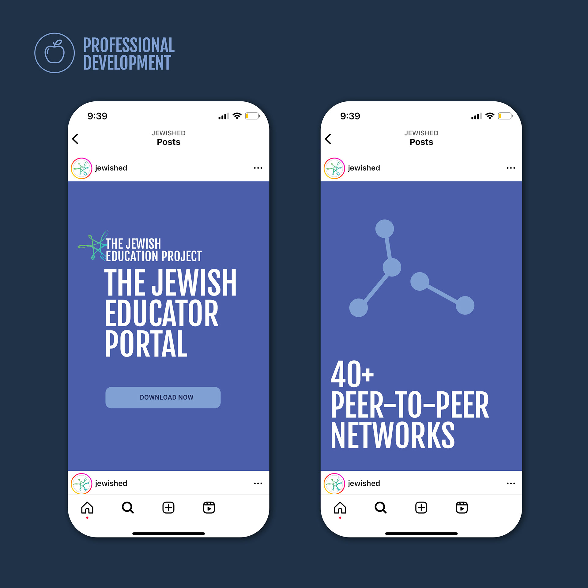


The Challenge: The Jewish Education Project is an education non-profit serving 150 countries and impacting over 500,000 youth annually with a broad variety of programs and initiatives including; online learning tools, conferences, fellowships, donor programs, thought leadership pieces, podcasts and multiple smaller programs. They were looking to conduct a brand refresh that maintained brand equity but was more easily identifiable, stood out in their field and organized their sub-brands into easy to understand systems. The Solution: The logo was updated with a new type treatment. The logo icon, the star, remained but was narrowed to be more symmetrically weighted and updated to a more limited palette. A new brand color system was created using their original primary brand colors but expanded to include complimentary colors that passed Web Accessibility standards. Brand fonts were updated. A brand Icon, and guidelines around its use, were developed. Sub-brands were organized into buckets and design guidelines were created for each.
